Land's Craft
About
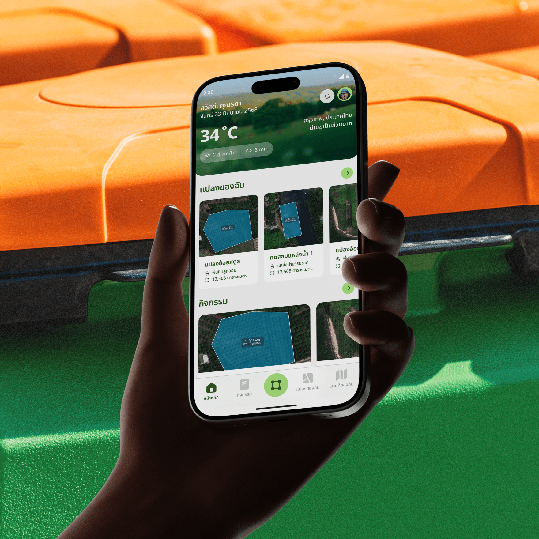
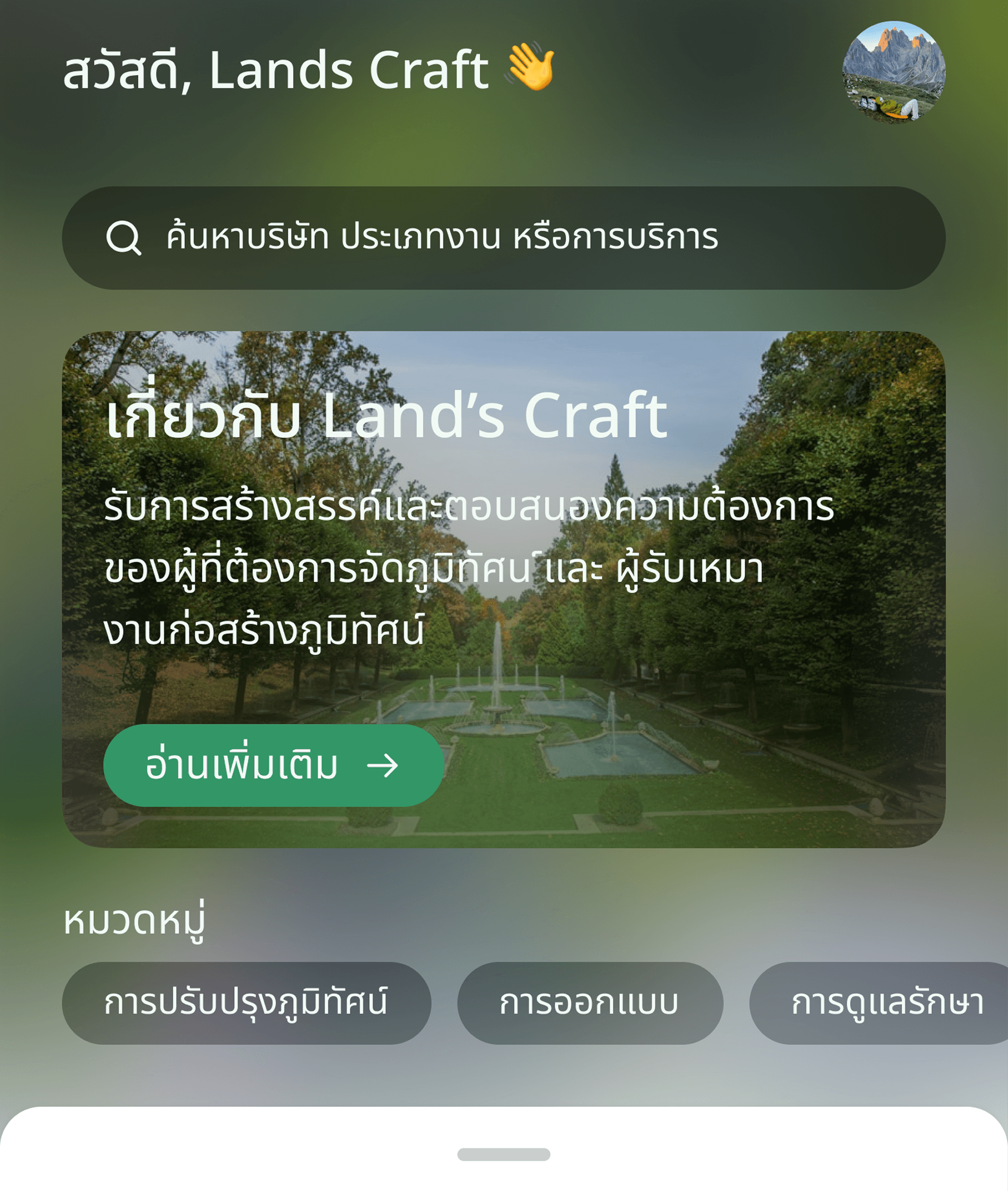
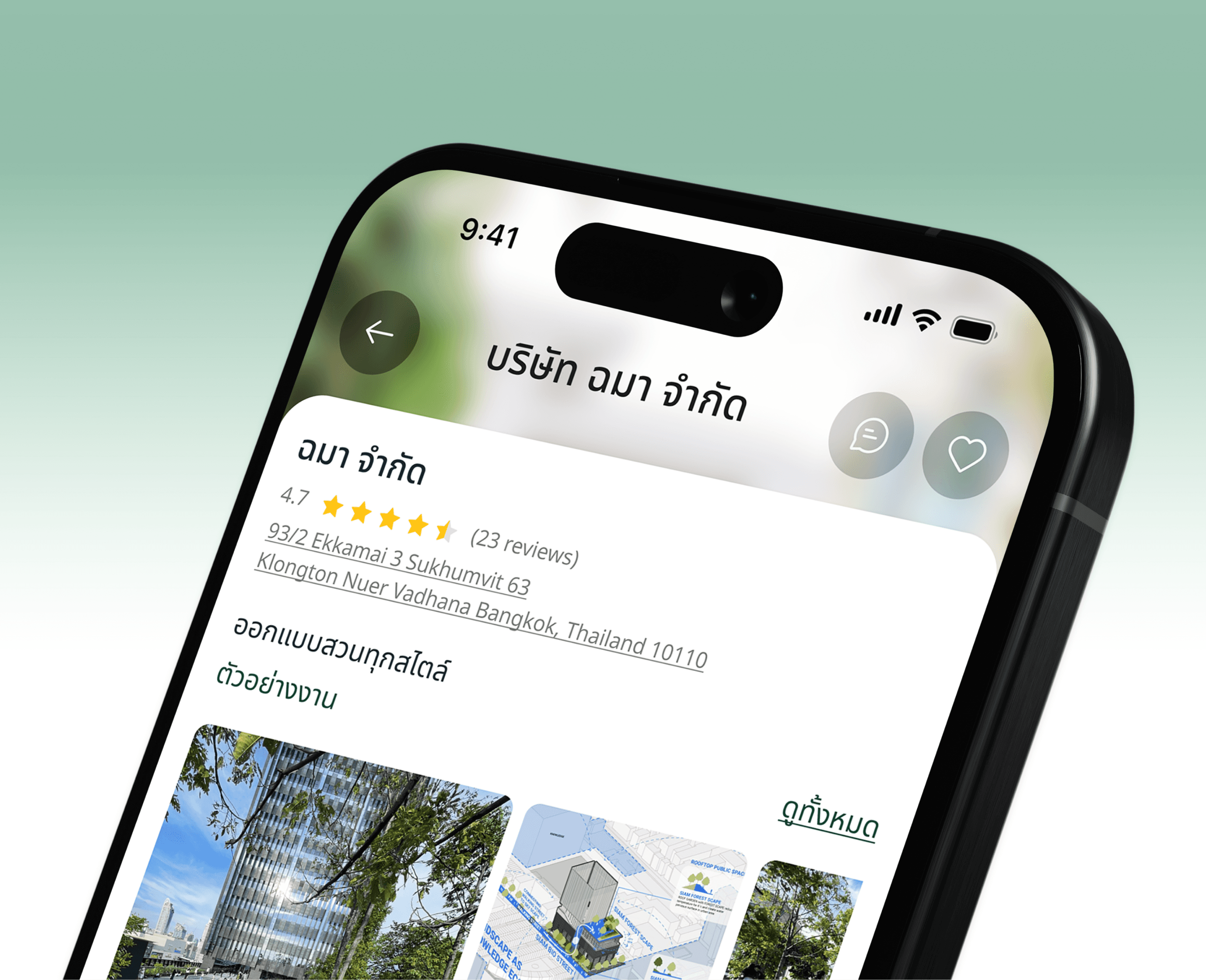
Mobile app for connecting users with garden design and landscaping services
Client

Land's Craft
Services
- UX / UI Design
Year
2024
[Design system]
Typography
In this project, users are required to read and fill out digital forms, so the typeface must ensure clarity, readability, and trustworthiness — all essential for good UX/UI design.
Light
300
a
Regular
400
a
Medium
500
a
Semibold
600
a
Bold
700
a
Colors Palette
The color palette is designed to evoke a sense of calm and trust, while also providing clear visual hierarchy and accessibility. The primary blue conveys reliability and professionalism, while the secondary colors offer contrast and emphasis for key information.
Sea Green
#339667
primary Color
This is the base color of your website/brand. Everything stems fromthis one color. Its kind of important.
Sea Green
#339667
Polar
#F2F9F9
secondary Color
This is a supporting color that complements the Primary Color and adds balance to the design. It’s used to stand out without overpowering the primary color.
Polar
#F2F9F9
Slate
#242424
dark Color
This is one of your neutral color. It’s suitable for usage as Texts, overlays,shadows, and also headings.
Slate
#242424
Wild Sand
#F5F5F5
light Color
This is your other neutral color. It’s when you need subtle differentiation against all that white (usually for backgrounds). Its also suitable for light mode dialogs/alerts
Wild Sand
#F5F5F5
[Get the highlights]
Other